
In Brief:
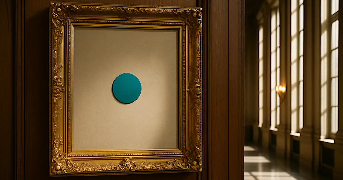
The UK government spent £532,000 moving a dot halfway up the GOV.UK logo and changing its colour. Taxpayers got a turquoise full stop and 150 pages of brand guidelines explaining how “the dot” serves as a “guiding hand for life” whilst the NHS maintenance backlog hit £16 billion and people struggle to heat their homes. The visual change took 10 months to deliver through contracts with ad agency M&C Saatchi, despite the Gov.uk Design System being built specifically so components could be reused quickly and cheaply across departments.
When designer Matt Eason filed a Freedom of Information request asking to see the research, concepts, and development process, the government refused. They claimed policy formulation secrecy even though external agencies did the work, then said the information was already public but only linked to final brand guidelines. Compare this to February 2024 when they changed the Crown for King Charles seamlessly within normal operating costs. The lack of transparency means we’ll never know if £532,000 represented value or daylight robbery.
The real scandal isn’t the dot. It’s what it reveals about broken government procurement. Public sector IT projects run over time 80% of the time versus 50% private sector. Fourteen percent exceed their budget by at least 100%, and 4% blow out by 400% or more. Under PFI contracts, changing a lightbulb cost £300. The National Audit Office found government could save £500 million over five years just by improving how they buy basic goods like energy and travel. Operating costs in privatised British railways are 40% higher than state-run services in France and Sweden.
Both Labour and the Conservatives share blame. Two of the three contracts were signed under Sunak’s government before July 2024, but Labour extended the work and took the political heat. Rachel Reeves launched an “Office for Value for Money” that MPs described as understaffed and poorly defined, likely to waste money whilst supposedly saving it. Public satisfaction with UK government services dropped from 79% to 68% in the past decade. The average adult spends a week and a half dealing with government bureaucracy annually. Despite £26 billion spent on digital services, 47% of central government services still lack a digital pathway, and accessibility monitoring found nearly 30,000 issues across 1,203 websites. The system doesn’t work, won’t be fixed, and nobody in power gives a toss because they’re insulated from the consequences.
The Gov.uk Rebrand Scandal That Proves Government Procurement Is Broken
The government spent £532,000 on what looks like someone shifting a full stop halfway up the GOV.UK logo and changing its colour to turquoise. That’s what taxpayers forked out whilst the NHS crumbles and people can’t heat their homes. And the more you dig into this mess, the worse it gets.
Reform UK’s Zia Yusuf called it “an insult to taxpayers” and worked out it is more than a starter home costs in Burnley (he needs to see how much a starter home is, I think).
Social media went mental. One comment summed it up: “I’d have done it for a Freddo and a sandwich.” Fair point, really. But I’d have wanted a Costa coffee and a slice of lemon drizzle as well.
But before we grab the pitchforks, there’s context. Not enough. Not justification. Context. Because whilst the headline is rage-inducing, the real scandal runs deeper than a pricey logo refresh. This is about how catastrophically broken government procurement has become, and why nobody with the power to fix it gives a toss.
What Actually Changed
The rebrand launched in June 2025. The dot (technically a full stop in the GOV.UK wordmark) moved from sitting at the baseline to floating halfway up the letters. They also changed it from black to turquoise and switched the background from black to blue. On first glance, it looks like a Friday afternoon piss-about in Photoshop.
The £532,000 wasn’t just for that visual tweak, though. The Government Digital Service worked with ad agency M&C Saatchi on what they called a full “design system overhaul” covering thousands of government web pages, updated brand guidelines (all 150 pages of them, explaining how to use “the dot” as a “guiding hand for life”), new stationery, posters, PDFs, forms across every department, accessibility improvements for screen readers and visual impairment, and technical implementation across the entire Gov.uk infrastructure serving over 50 million monthly visits.
Fair enough. That sounds like proper work. Except, and this is critical, the Gov.uk Design System already existed. It was built specifically so components could be reused across departments with minimal fuss. The Home Office uses these pre-built Gov.uk components and just adds their own bits on top. The MOD does the same. The entire point of the system is to reduce duplication and make updates quick and cheap.
So when they say it took 10 months and half a million quid to refresh a system that’s designed for easy reusability, that’s when the alarm bells start ringing.
The Transparency Black Hole
Here’s where it gets properly dodgy. Designer Matt Eason, who works with Gov.uk services professionally, filed a Freedom of Information request asking to see the research, concepts, and development process. Not to take the piss, but out of genuine professional curiosity.
He wanted to know
- what research pointed to the existing brand not working,
- what different iterations they explored,
- whether they went wild and experimental before landing on “move the dot up a bit.”
All bloody good questions in my opinion.
The Department for Science, Innovation and Technology told him to sod off. They claimed Section 35 of the FOI Act (policy formulation requiring secrecy) even though this was public-facing work done by an external agency, not internal civil servants. They also claimed the information was already public under Section 21, then only linked to the final brand guidelines.
- No research.
- No testing.
- No concepts.
- Nothing. Bugger all.
LinkedIn designer Adrie van der Luijt pointed out the obvious contradiction:
“This wasn’t about internal civil servants in a ‘safe space’. It didn’t involve sensitive policy advice, but a public-facing rebrand by an external agency.”
Compare this to the Crown change in February 2024 when Charles became King. That update was done seamlessly, transparently, and covered within usual operating costs.
So why the hell did moving a dot cost £532,000 when changing the Crown cost normal operating expenses?
Without transparency, we’ll never know if we got ripped off or not. And that’s precisely how they like it. But I think we did. And that’s being diplomatic!
The Scale Defence Only Goes So Far
Some Reddit users defended the cost, arguing it encompassed comprehensive user research, accessibility testing, and implementation across critical government infrastructure. One comment noted: “The £532k was spent on consultancy and redesign to ensure that all gov.uk materials were as readable and accessible as possible.”
That’s a fair point. Accessibility matters. Government services need to work for everyone, including non-users who might need to access them in future. The £100,000 contract with user experience firm Lnet explored “emotional or intellectual associations” with different designs. The Cabinet Office intended rigorous testing with particular focus on inclusion.
But even at enterprise scale, a 40-component design system with full documentation, testing, and implementation costs around £288,000 and takes three people 10 months. That’s building from scratch. Gov.uk was refreshing an existing system. Not a full ‘from scratch’ build.
Most small businesses pay £300 to £1,500 for a professional logo. Even massive corporate rebrands by top agencies hit £5,000 to £50,000.
The government spends £26 billion annually on digital and data across the public sector. With that kind of budget, you’d expect better value than half a million for what the Suffolk Gazette satirically described as “a visual metaphor for optimism, renewal, and the piggybank of national progress.”
Why Government Projects Cost 10 Times More
Research shows that 80% of public sector IT projects run over time, compared to just over half in the private sector. Cost overruns happen in nearly 50% of public sector projects versus 33% private sector. The average IT project cost overrun is nearly three times higher for public sector work.
Get this: 14% of public sector projects exceed their budget by at least 100%. Four percent blow out by 400% or more. In the private sector, only 7% double their budget and just 1% quadruple it.
Public sector projects take an average of 3.9 years to complete versus 2.4 years private sector. Governments often lack protocols for killing failing projects, so they just keep throwing money at them. Policy objectives change with governments, causing scope creep. The public sector pays 35% less for technical roles (that’s a £30,000 annual gap for technical architects), so they rely heavily on contractors who cost three times more than permanent staff. Recruitment campaigns now fail 50% of the time, up from 22% in 2019.
Only 9% of government tech projects are rated ‘Green’ (likely to succeed). Tech projects are 60% more likely to be rated ‘Red’ (highly at risk) than non-tech projects. Public satisfaction with UK services has dropped from 79% to 68% in the past decade.
The £300 Lightbulb Problem
Under PFI (Private Finance Initiative) contracts, changing a lightbulb actually cost £300. Installing a single plug socket in a PFI school? Another £300. These weren’t isolated cock-ups. They were baked into contracts that successive governments signed to avoid showing capital expenditure upfront, whilst locking taxpayers into decades of inflated service fees.
The private sector was supposed to be more efficient. Instead, it led to exploitation of workers, the public paysmasters, and spectacularly bad value for money. Adding a profit motive didn’t drive efficiency. It drove price increases and corner-cutting.
The UK public sector spends over £393 billion annually on goods and services. That’s one in every three pounds of government spending. The National Audit Office found that public bodies could avoid £500 million in costs over five years just by improving how they procure common goods like energy, temporary staff, and travel. The Cabinet Office reckons increased competition could deliver annual benefits between £4 billion and £7.7 billion.
Why doesn’t it happen? Because public sector procurement is slower, more bureaucratic, and subject to intense scrutiny, whilst private sector decisions get made quickly. Public bodies are driven by “the needs of society,” which sounds noble until you realise it means they have less purchasing power, less flexibility, and get absolutely shafted on price.
The NHS Maintenance Nightmare
The cost to eliminate NHS backlog maintenance has hit nearly £16 billion in 2024/25, up 15% from the previous year. Urgent repair costs have tripled in the past decade to £2.7 billion. High-risk maintenance (stuff that could cause “catastrophic failure, major disruption to clinical services or deficiencies in safety liable to cause serious injury”) has risen 256% since 2004 to £1.8 billion. The backlog now represents 92% of the entire annual running costs for the whole NHS estate.
Some hospitals have leaking roofs causing mould that aggravates respiratory issues for vulnerable patients. This isn’t theoretical waste. It’s actively harming people whilst the government spent over half a million moving a dot up a logo.
The Usability Problem Nobody Fixes
The government’s own review from January 2025 found that 47% of central government services and 45% of NHS services still lack a digital pathway. The average UK adult spends a week and a half dealing with government bureaucracy every single year. Someone moving home needs to contact 10 separate organisations. Managing a long-term condition requires interaction with more than 40 services across 9 different organisations.
HMRC handles around 100,000 calls each day. The DVLA processes about 45,000 letters daily. Defra still manages over 500 paper form-based services. Government accessibility monitoring from 2022-2024 found nearly 30,000 accessibility issues across 1,203 websites and 21 mobile apps. Poor colour contrast. Lack of keyboard navigation. Inaccessible design for screen readers. These are foundational accessibility principles that have been standard practice for decades.
Despite spending £26 billion annually on digital and data, they’re producing services that look and feel like they were designed when Tony Blair was in his first term.
Who’s Actually to Blame
The Labour government took the heat when this launched in June 2025, but the project was committed to and two of the three contracts were signed under the previous Conservative government before July 2024. Labour extended the work but inherited the bulk of it. Both parties share responsibility. Neither wants accountability.
Rachel Reeves launched an “Office for Value for Money” earlier this year, which MPs themselves described as an “understaffed, poorly defined organisation” that risks wasting taxpayer funds whilst supposedly saving them. The Treasury select committee said it had “unclear aims and targets” and might be “something of a red herring.”
Meanwhile, waste crime alone costs UK taxpayers an estimated £1 billion per year, and the government’s been repeatedly slammed by the House of Lords for failing to address it. Half a million on a dot suddenly seems less insane when you realise there’s a billion quid literally being dumped in illegal landfills whilst nobody does anything.
What This Actually Reveals
Could a competent designer with modern tools have done the visual refresh for £1,000? Yes.
Could the full system implementation have been done for far less than £532,000 by a lean team using sensible methods? Absolutely.
The real scandal isn’t that design systems cost money. It’s that government procurement, governance, and delivery models are so catastrophically broken that they routinely pay three to ten times what private organisations pay for equivalent work.
And they’ve shown zero interest in fixing it.
Public trust in federal government sits at just 24%. Seventy percent of the Top 75 services score below private sector benchmarks. Poor user experience doesn’t just inconvenience people. It undermines trust, widens inequality, and reduces the effectiveness of public administration.
The Gov.uk rebrand isn’t an isolated cock-up. It’s a visible symptom of systemic dysfunction. The refusal to show working, the inflated costs, the lack of accountability, the broken procurement processes that turn £1.50 lightbulbs into £300 invoices. This is how government operates now. Taxpayers fork out billions for substandard services, nobody gets held accountable, and the cycle continues.
You could hire a decent freelance designer for £1,000, give them access to the existing Gov.uk Design System components (which are already built and documented), and have them update the visual styling in a week. Instead, they spent £532,000 over 10 months to update a system that’s specifically designed to make updates quick and cheap through reusability.
The anger isn’t just about the money. It’s about what the money represents: a system that doesn’t work, won’t be fixed, and actively punishes the people paying for it.
MPs don’t give a toss because they’re insulated from the consequences. The NHS crumbles. Services fail. Costs balloon. And somewhere in Whitehall, someone’s approving another half-million-quid contract to change the colour of a button.
That’s the reality.
And until there’s transparency, accountability, and consequences for waste, nothing will change.
Questions Many Ask About the Gov.uk Rebrand
How Much Did the GOV.UK Logo Rebrand Actually Cost Taxpayers?
The Government Digital Service spent £532,000 on the rebrand project through contracts with ad agency M&C Saatchi. This included moving the dot in the GOV.UK logo halfway up and changing its colour to turquoise, along with updating brand guidelines, design system components, and implementing changes across government departments. The project took 10 months to complete despite the design system being built specifically for quick, reusable updates.
What Exactly Changed in the New GOV.UK Logo?
The full stop (dot) in GOV.UK moved from sitting at the baseline of the letters to floating halfway up. They also changed the dot’s colour from black to turquoise and switched the background from black to blue. The Crown and GOV.UK wordmark remained unchanged, making it a refresh rather than a complete rebrand.
Who Approved This Spending, Labour or the Conservatives?
Both parties share responsibility. Two of the three contracts were signed under Rishi Sunak’s Conservative government before July 2024, but Labour extended the work when they took office. Labour took the political heat when the rebrand launched in June 2025, even though the bulk of the project was committed to under the previous government.
Why Won’t the Government Release Details About the Rebrand Process?
When designer Matt Eason filed a Freedom of Information request asking to see research, concepts, and development work, the Department for Science, Innovation and Technology refused. They claimed policy formulation secrecy under Section 35 despite the work being done by an external agency, then said information was already public but only linked to final brand guidelines. Without transparency, taxpayers can’t judge whether the cost represented value or waste.
How Does This Compare to Other Government Rebrands?
When the Crown changed in February 2024 for King Charles III, the update was completed seamlessly within normal operating costs. The contrast between changing the Crown for free and spending £532,000 to move a dot highlights the inconsistency in government spending. Most small businesses pay £300 to £1,500 for professional logo work, whilst even major corporate rebrands by top agencies cost £5,000 to £50,000.
Is Government Procurement Really This Broken Across the Board?
Yes. Research shows 80% of public sector IT projects run over time compared to 50% in the private sector, and 14% exceed their budget by at least 100%. Under PFI contracts, changing a lightbulb cost £300 and installing a plug socket another £300. The National Audit Office found government could save £500 million over five years just by improving procurement of basic goods like energy and travel.
What Can Be Done to Stop This Waste?
The National Audit Office identified that increased competition in public procurement could deliver annual benefits between £4 billion and £7.7 billion. This requires structural reform of procurement processes, transparent contract awarding, better project governance with clear protocols for stopping failing projects, and accountability for those approving wasteful spending. Without political will to fix the system, the waste continues.
Sources
Ministers won’t release research behind GOV.UK brand refresh
designweek.co.uk
State of digital government review
gov.uk
PFI and PF2
nao.org.uk
Managing PFI assets and services as contracts end
nao.org.uk
Efficiency in government procurement of common goods and services
nao.org.uk
Infrastructure and Projects Authority Annual Report 2023-24
gov.uk
Delivering major projects in government: a briefing for the Committee of Public Accounts
nao.org.uk
NHS Estates & Facilities Backlog Maintenance & Critical Infrastructure Risk (pdf)
england.nhs.uk
Another Year, Another Leak: Is A Deteriorating NHS Estate a Feature of National Policy?
kingsfund.org.uk
GOV.UK Design System
design-system.service.gov.uk