
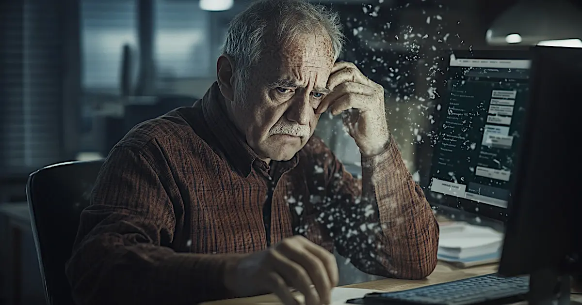
Welcome to the ego circus. Grab a seat, bring a sick bucket.
It’s June 10th, 2022, and somehow people are still building websites that scream Look at me! louder than a Love Island contestant on Instagram Live.
You click a link expecting help, answers, a bit of value… and instead, you’re slapped in the face with a digital shrine to someone’s fragile self-worth. Stock photos of awkward handshakes. Menus that require Google Maps to navigate. And don’t forget the ten-paragraph intro that reads like a love letter to themselves.
This isn’t just bad. It’s bloody tragic.
The ‘Me Me Me’ Homepage Parade
“Welcome to my website. Let me tell you how incredible I am. I’ve been doing this since 1873. My cat thinks I’m brilliant. And here’s a slideshow of every certificate I’ve ever laminated.”
Oh, piss off.
Visitors don’t care how much you love yourself. They’re here to solve a problem, not read your autobiography.
Imagine walking into a shop and being greeted with, “Hi, let me tell you why I’m amazing,” instead of “How can I help you?” You’d walk out. Probably backwards, flipping them the bird.
Bells, Whistles, and 1996 Called
Flashing animations. Spinning logos. Background music that starts without warning like a pub DJ having a breakdown.
Honestly, what in the sodding hell is this?
If your website looks like it was last updated during the dial-up era, you don’t need a redesign—you need an intervention. Modern websites are clean, fast, and user-focused. Your cousin Barry’s idea of “adding a bit of pizzazz” is why people bounce faster than a cheque from a fake guru.
Menus That Require a PhD
Ah yes, the 8-level dropdown menu from hell. Because nothing says “We value your time” like forcing visitors to play a guessing game with every bloody click.
Users aren’t on your site for a treasure hunt. They want clarity. They want speed. They want a brain-friendly layout, not a test of endurance.
Keep it simple. If Amazon can show you a million products with three clicks, why does your five-page website feel like solving a Rubik’s Cube in the dark?
The Photographer Fable (AKA: Ego vs Evidence)
About ten years ago, I reviewed a wedding photographer’s website. Looked pretty, sure, but it was all about him. Every bloody sentence. Not a single mention of the customer.
I gave honest feedback, like a grown-up: “You might want to write this from the perspective of what the bride will get or what the bride’s mum will be interested in, simplify the layout, and actually think about what they need.”
Dead silence. Then denial.
He argued. I asked him how many books or courses he’d studied on usability, sales copy, or conversion optimisation.
His answer? “None. I just do what I’ve seen other people do.”
Classic. Monkey see, monkey build shite website.
Why Big Sites Don’t Do Your Crap
You ever see Google banging on about how clever their engineers are on the homepage? Apple listing every award they’ve won since 2001? Amazon starting with a heart-warming story about Jeff Bezos in a garage?
Course not.
Because they understand one simple rule: the site is not about them.
It’s about the user. The buyer. The nosy browser. Whoever. It’s about solving problems fast, clearly, and without making people feel like they’ve accidentally clicked into a midlife crisis.
These companies spend millions researching human behaviour. They know what works. And yet, some knob in the pub who “builds websites on the side” will tell you that what you really need is more plugins, pop-ups, and a 12-minute autoplay video.
Sod off, Joe. Stick to pulling pints.
Conclusion: Your Website Isn’t a Mirror
If your homepage reads like a love letter to yourself, don’t be surprised when people bounce. No one came to stroke your ego. They came for something they need. Something that helps them.
Your job? Make it easy. Make it clear. Make it about them.
If your mate can’t find your phone number in under ten seconds, start again.
If your homepage takes longer to load than a microwave lasagne, start again.
If every heading sounds like it belongs in your CV, start again.
Brutal? Maybe. Necessary? Absolutely.
Questions You Should Actually Ask Before Building a Website
Why Should Website Content Focus on the Customer?
Because the visitor is the one with the problem. They’re the one with the wallet. If your site talks only about you, you’re basically trying to sell a mirror instead of a solution.
What’s Wrong with Adding Flashy Animations to My Homepage?
Unless your business is flashy animations, they’re pointless distractions. They slow your site down, confuse users, and look like you’re stuck in the Netscape era. Less is more, always.
Do Dropdown Menus Hurt User Experience?
Yes—especially when you stack them like a Russian doll. Keep it to one or two levels max. The goal is to guide users, not test their patience.
How Does Bad Website Usability Cost Me Customers?
They leave. Simple as that. Confusing layouts, cluttered content, and ego-driven nonsense make people click away. Every second wasted is a sale lost.
Can I Trust DIY Website Builders or Mates Who Do It on the Side?
Only if they understand usability, accessibility, SEO, and design psychology. Otherwise, you’re just slapping paint on a damp wall. It’ll peel. It always does.